watercolor journaling, opera pink, problem-solving
The LMA spring journaling course is officially over (the last projects dropped yesterday) and, weirdly, I’m thinking of signing up for the summer course.
I say “weirdly” because I had just about decided the journal style was not my thing. The journal videos are silent, which is fine as an instructional tool, but I found I really miss the banter/chatter. Plus, the projects didn’t speak to me that strongly. It’s been an art-heavy three months, but I’ve been focused on mixed media illustrations and playing with my new marker set. I’m ending the season at 7 out of 53 projects done. In one sense, that’s fine. Sarah was adamant about not viewing the projects as tasks to fall behind on; they’re just an open-ended source of inspiration. They will all still be there if I feel like doing them later. However, under the circumstances, I really shouldn’t be considering the summer course.
But the summer sneak peek looks fun! And I feel like summer projects may be more my vibe content- and color-wise. And I’m going through a mini-LMA resurgence; I did two of the journal projects this past week.
The real power play here is not to buy the summer course, and instead finally buy bleedproof white, so I can enthusiastically throw myself into all the BPW-heavy projects I glossed over earlier. BPW is really an essential tool and it’s wild I haven’t gotten around to buying it yet.
===
Hot take: I’m not a fan of opera pink. I like saturated colors, and I like pink, but that particular shade of neon pink is too much for me. It’s more strident than FR magenta/fuchsia, two colors which I generally enjoy.
I do enjoy it from a character arc standpoint, because a couple years ago Sarah was obsessed with ultra soft dusty pinks, and now everything is OPERA PINK PINK PINK LET’S GOOOO
===
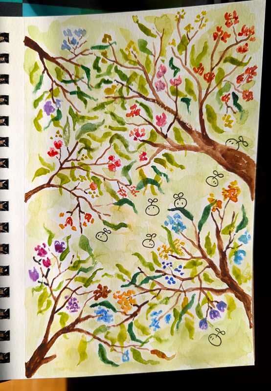
One interesting thing you get from the journal vids, and not from regular tutorials, is an unvarnished look into the creative process. For instance, from Sarah’s Loose Flowers & Leaves: “I didn’t end up liking the fruit that I added so I used that as an opportunity to make a soft peachy pink background to try and get the weird fruit to blend in.” It’s the artist’s craft, making decisions and solving problems on the fly. Watercolor is a good medium for problem-solving. Looking at the finished product, you’d never know there used to be fruits. (Personally, I think the fruits looked good. But the peachy background also looks good, especially with bleeds from the purple flowers, so it’s win-win.)
In my own rendition, I went with a spring green background because I wanted to give the impression of more foliage in the background. It changes the whole vibe. I feel like Sarah’s is more contextually abstract (could be spring, could be summer, could even be an indoor arrangement) whereas mine is firmly a springtime piece.
An oft-repeated maxim in watercolor is to trust the process (alt phrasing: “don’t fear the ugly stage”). It’s common for watercolor pieces to have an ugly/awkward middle stage when you’re just starting to loosely render, and it’s like, what is this hot mess. What are all these blobs. You just gotta keep going. Which is easy when you’ve watched a whole tutorial video, and you know it looks great 15 minutes from now, but less easy when you’re composing your own piece and possibly not even certain what else you’re going to add to make your pic stop looking like a blurry chopped salad.
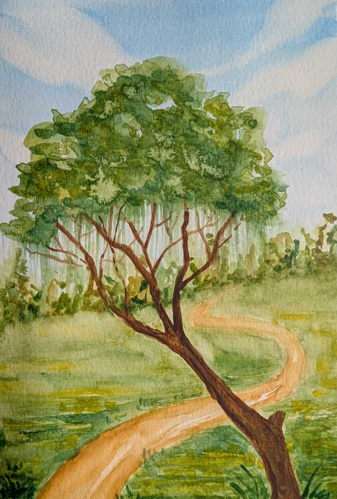
The worst piece in my current sketchbook is a very plain landscape with a grassy field, a dirt path, and a tree. That’s it. I started with no plan, just vibes. When it was just the grass and the path I was like, oh yikes, this is the literal most boring picture of all time, help, what do. Then I added the tree and some grass textures and that brought it down to like 8/10 levels of boring. (And I like the foliage texturing on the tree—I added salt—so the pic isn’t a total loss.)
In retrospect, what I wish I’d done is to put in the tree upside down. Like, why not? Could be fun. And I didn’t like the piece anyhow so I had nothing to lose. This is another watercolor lesson: being less precious with one’s own work. With pen drawings, I add a couple things and then am afraid to add more for fear of messing it up. With watercolor, adding more stuff and layering is basically the whole game. Sarah has said you learn more from “bad” pieces because you aren’t afraid to experiment and try new stuff and maybe you discover something unexpectedly cool.
I feel like “put the tree upside down” is not a solution you’re ever going to see in a LMA vid. Sarah’s style is rather too realistic for that. I’m definitely going to try it at some point though.
===
pictured: my rendition of Loose Flowers & Leaves, and the most boring landscape of 2026
Photos
Comments
Times shown in UTC
JustMegawatt
The art is great, art is so difficult. It looks like magic to me, as someone who can’t really draw anything.
Achaius
@JustMegawatt thanks! tbh I feel like watercolor itself is kind of magic, as someone who has been a sketch artist for a long time but is new to this whole landscape business. watercolor is just so fluid and expressive
You must be signed in to post a comment.